BriteCore began in 2009 as a product built for small insurance carriers. These companies typically provided insurance for homes, businesses and farms. Our product worked well in these cases, but if they wanted to provide different types of insurance our system handled it poorly. This led to technical debt and increased support.
We knew it was critical to make our product more flexible if BriteCore was going to be widely adopted throughout the insurance industry. To accomplish this, we began work on a new rating engine.

How Rating Engines Work
Lines, the rating engine in BriteCore, is a configuration tool for different insurance products (often called Lines of Business). To better understand this, a stripped-down configuration for a homeowners policy is below. “Data” describes information collected from the customer. “Calculations” describe how that information affects coverages and the premium.
# Homeowners Line of Business

### Data
* Year Built
* Replacement Cost (Cost to rebuild home)
* Roof type (Shingle, Metal, etc.)

### Calculations
Coverage A (Damage to Home)
* Limit (Maximum you can receive in a claim)
    - Matches Replacement Cost

Coverage C (Damage to Personal Property)
* Limit
    - Typically 50% of Replacement Cost

Policy Premium (How much you pay per year)
* 1% of Replacement Cost
Discovering the Limitations of UI-driven Product
The primary people using Lines are BriteCore’s own internal team of content analysts. Through a series of collaborative sessions with them, we were able to identify several problems:
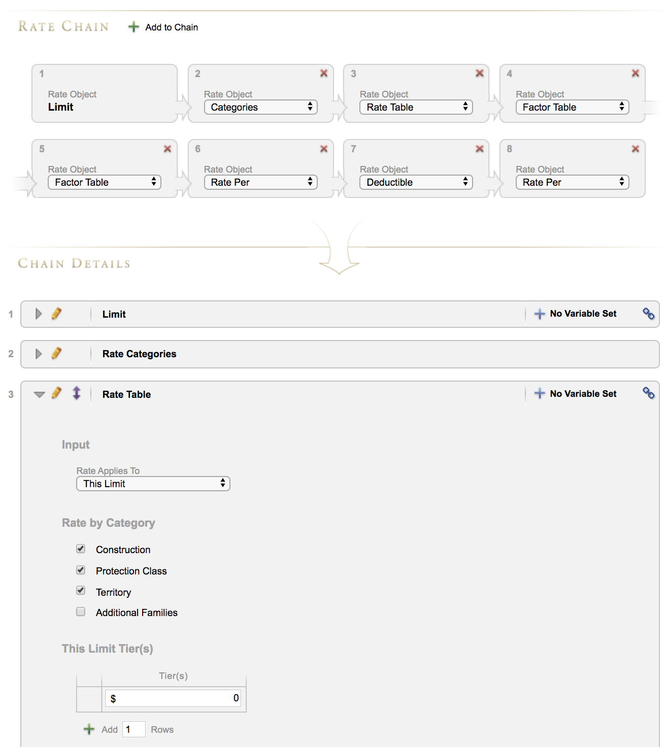
- They validated our assumption that the Lines user interface wasn’t flexible enough to support different types of insurance.
- We also learned the product didn’t provide a lot of context - if you were picking up someone else’s work, it was difficult to understand what they had done and why.
- Finally, if two sets of changes conflicted with each other, it was difficult to reconcile them.
Understanding these problems helped me think through potential solutions with our engineering team. The current product was setup to be an entirely “point and click” experience, and over several years many different features and options had been added to it to support a growing client base. This made for an interface that was hard to understand, and inefficient to use.

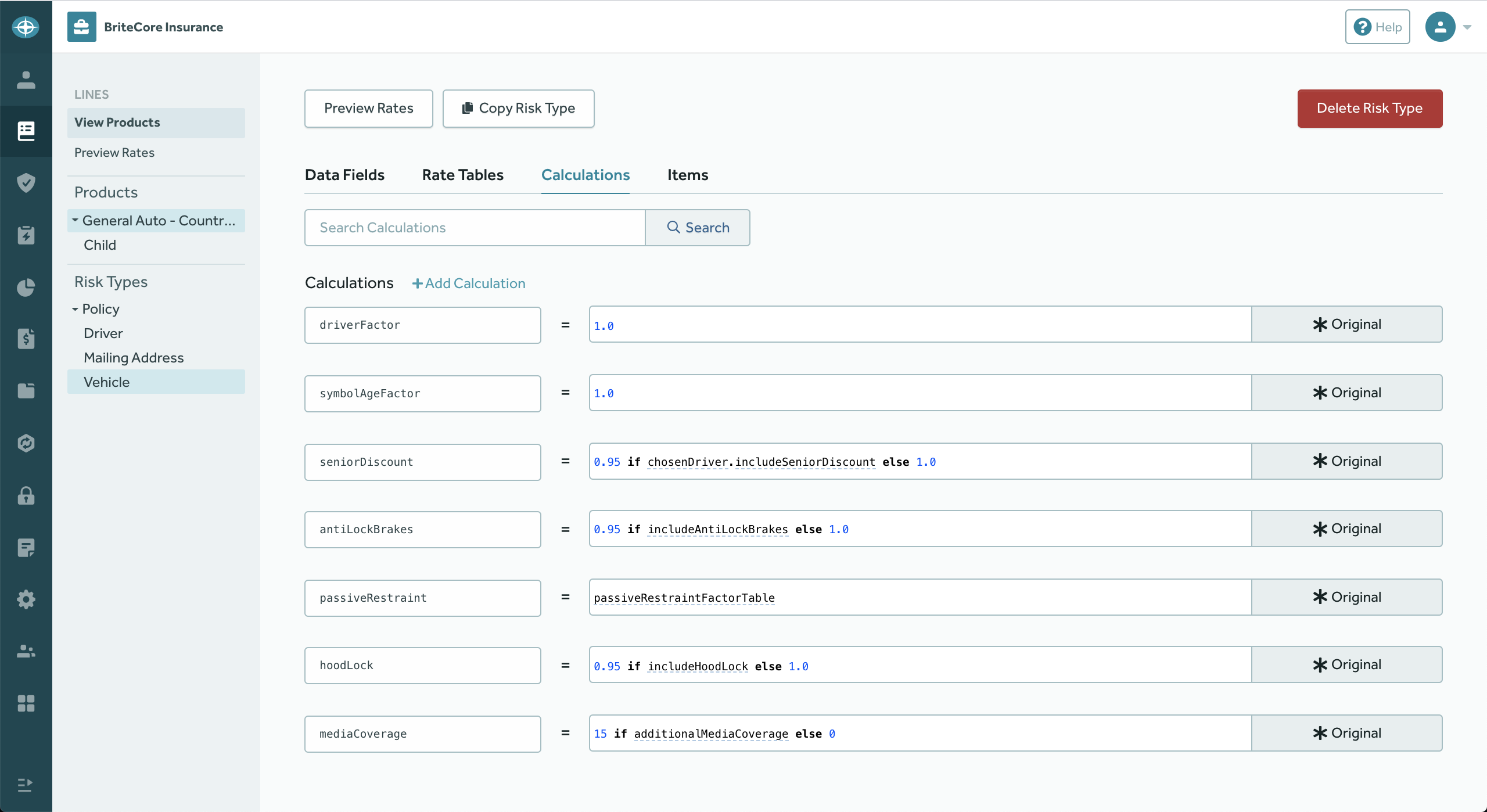
Shortly before taking on a full redesign of Lines, we added a small code editor component to the existing tool, which let people use a python-based syntax for more complex calculations. This feature quickly became heavily used and was an inspiration for us to explore a more full-featured code editing experience.
Our hypothesis was that even though a code editor seemed more complex to use on the surface, it would actually remove unnecessary UI abstractions. This would not only improve the user experience, but would also allow us to leverage the flexibility of code to represent new types of insurance data.
The UX of Code
To prove out this hypothesis, we began building a proof of concept. Our product still had a UI, of course, but most of the key workflows were migrated to a code-based approach. Through close communication with our content analysts, we were able to quickly validate our hypothesis — they were able to start using the tool to build out a real configuration for a client’s automobile line. From there, the product grew and was eventually named “BriteLines”. In my role as the lead designer, I:
- Collaboratively designed the application’s information architecture with our developers
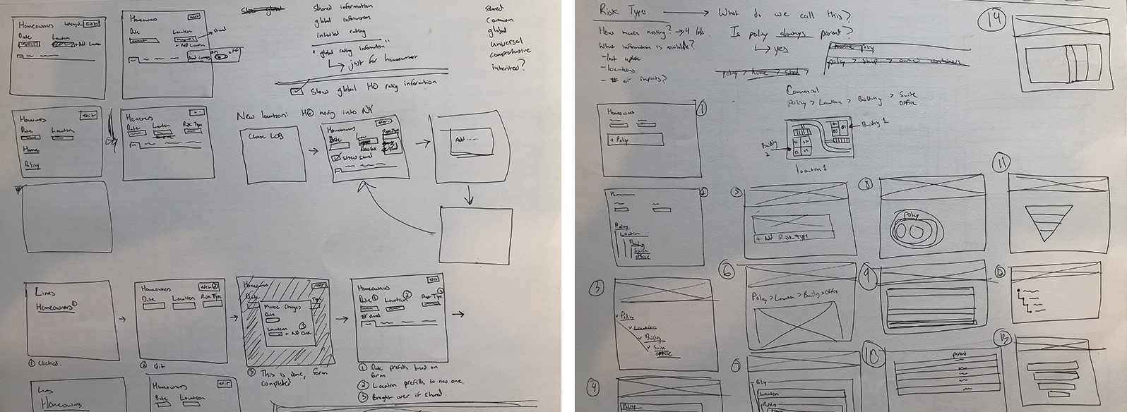
- Created sketches and high-fidelity mockups for pages
- Iterated on our developers’ pull requests to improve design consistency
- Conducted user testing with our content analysts
- Collected feedback to help drive our product roadmap

A challenge of our code-based approach was that we had to consider how to keep our custom syntax easy to understand. It is well documented, but I thought that wasn’t enough for our content analysts, who were technically minded, but not developers. By working closely with the project’s lead software architect, Grant McConnaughey, we were able to make several changes to improve this, including allowing different methods to be called in the same way (Previously, some required the use of quote marks, while others didn’t).
Better Context Improves Users’ Confidence
We also wanted to provide a way to learn more about a line of business someone was editing. Often, once these configurations are created, they are only touched once a year, when an insurance company updates its rates. Our users said in these scenarios it was difficult to understand where they needed to go to change something. Common questions included:
- What does the name of this item mean?
- Where is the data stored that I want to change?
- Where am I right now in the system?
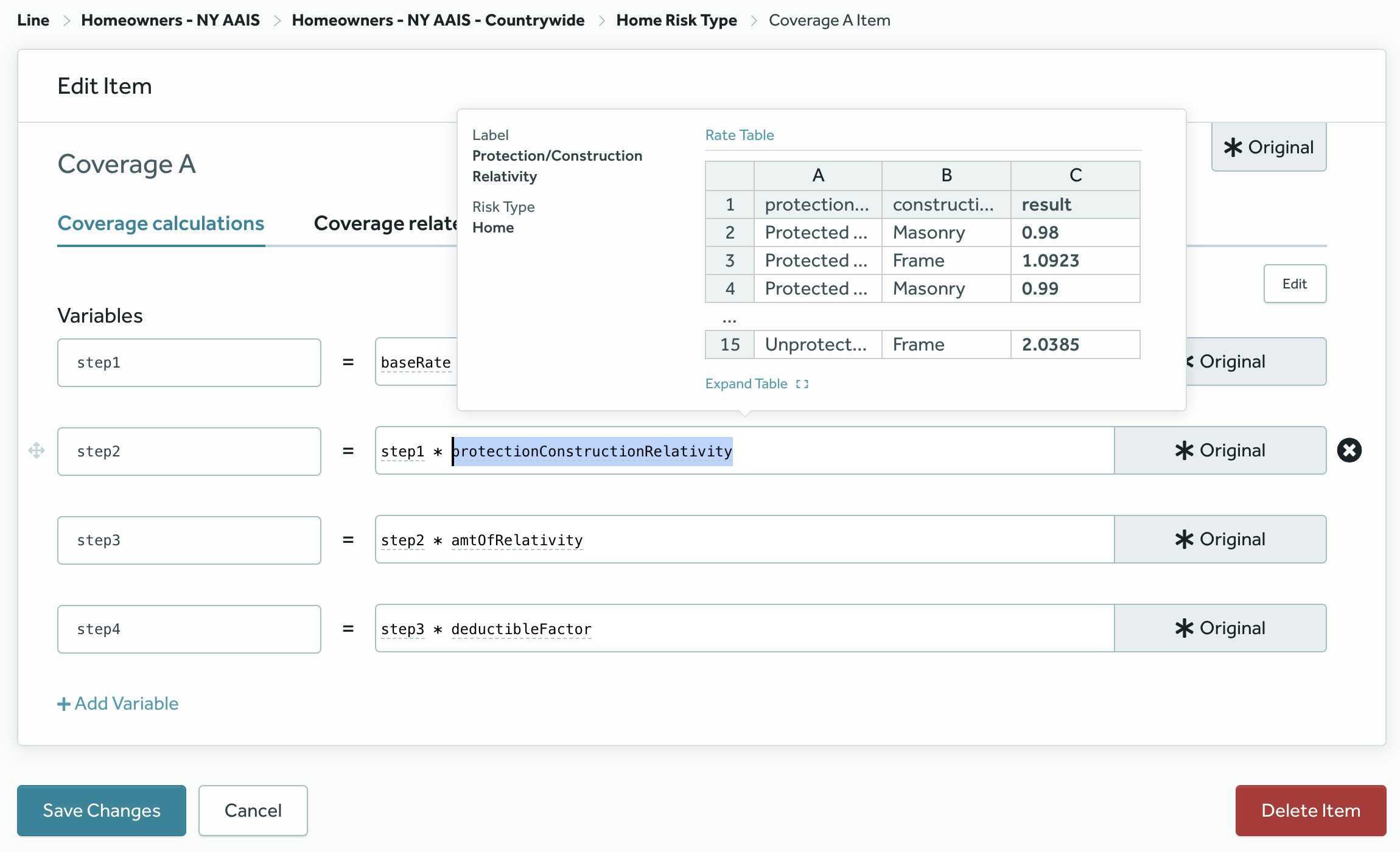
These questions led us to place a big emphasis on contextual tooling and wayfinding information in the interface.

A Shift Toward a Dedicated Product Team
Over the past year and a half, the BriteLines product has evolved from a proof of concept into a dedicated piece of BriteCore’s platform. During this time, we also scaled up the design team at BriteCore, and I moved into a leadership role.
As a result, I hired and onboarded a new designer, Laura Pfancuff, to take over the project. I’ve tried since then to strike a balance between letting her create her own design solutions, while also making sure I provided enough context so she could quickly make an impact.
Laura fully embedded on the team about a year ago now, and has been instrumental in creating workflows and designs for functionality we’d only started to think about at a high level when our redesign began. Seeing that evolution, both on this project and across everything I’ve done at BriteCore, has been one of the most rewarding parts of my time here.