A couple of weeks ago, our design team was able to attend Remote Design Week. The talks were great, and the fact it was remote worked really well for our fully distributed team.
The organizers tried hard to create a sense of virtual community, and part of this included a series of portfolio reviews done over Zoom. I was lucky enough to be one of the reviewers, and found that many of the portfolios we discussed in our sessions had similar issues to what I’ve seen during my time reviewing applicants for positions at BriteCore.
Overall Advice
That made me think it might be useful to write up my perspective on good guidelines to keep in mind with your portfolios. Obviously, this is coming from my own personal experience, so it’s worthwhile to get someone else’s perspective before making big changes!
Guideline #1 – You only have 60 seconds, if you are lucky
For an open position at BriteCore, we typically receive 400-800 applicants, and I review each one. First, I see how someone answered several application questions. Then, I look at their portfolio. In 1 minute, at most, I’ve decided whether someone will be considered for an interview, or rejected.
Guideline #2 – Be sure to have a digital presence
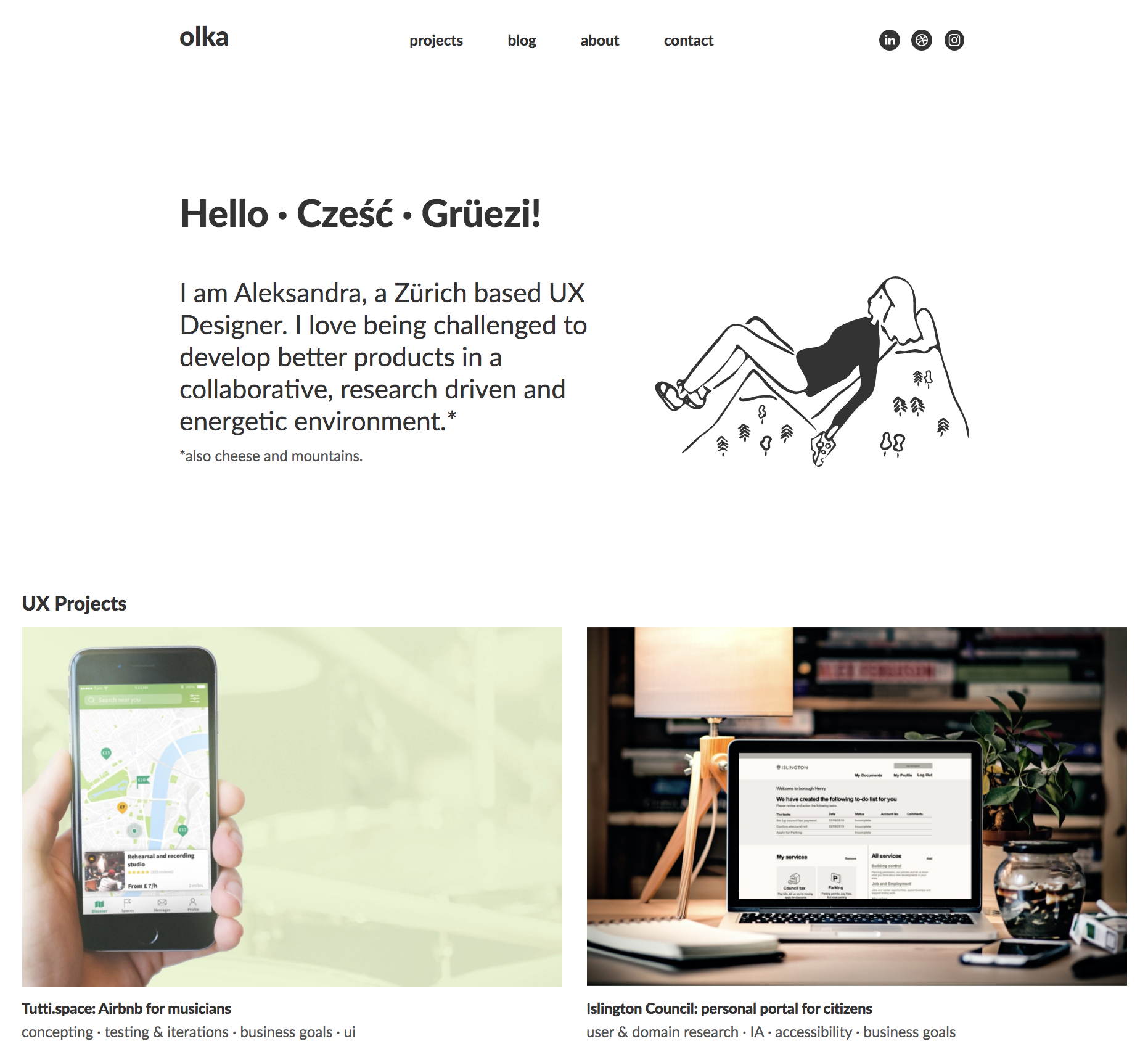
Whenever I see a candidate who only has a PDF portfolio, it’s sad, because it almost guarantees that they will lose out compared to everyone else that has a portfolio site. If you’re wanting to work on digital products, your portfolio should be in that medium.
Guideline #3 – A portfolio site is our version of a model home
Having a digital portfolio matters because it serves as a direct example of the quality of your work. If it’s hard to use or isn’t polished, you’ll have an uphill climb to convince hiring managers that your actual work is better than this.

Guideline #4. Page Performance Matters
Related to #3, but worth it’s own point, is page performance. If you only have 30 seconds, don’t spend more than a couple of them loading your site. You might think your portfolio loads quickly, but you want to make sure you are viewing with a cleared browser cache, as this is how hiring managers will see it the first time.
If it takes a while to load, people reviewing your work might become impatient and move on, or it might raise questions about how much you value performance in a product.
Case Study Selection
With some basics out of the way, we get to the main course of a ux/product design portfolio – the case studies. Arguably the most important piece of your digital presence, case studies will often make or break your chances at landing an interview. For starters, let’s talk about how to pick which ones to show.
Guideline #5 - Show us case studies, not just a gallery of images
If you don’t show in-depth case studies already, you’re hurting your chances of making it to an interview for most product design positions. Companies want to know what your process looks like. And walking them through one of your design projects will make it easier for them to envision how you would fit in on their team.
Guideline #6 – Aim for fewer, higher-quality case studies.
If you have more than 6(ish) case studies on your portfolio, you might want to edit them down. This is because you only want to show your strongest work, and with more than 6, it’s likely there’s room to cut. Focusing on your strongest work also means that any case study a hiring manager choses to read first will make a great impression.
Guideline #7 – Focus what you show on the type of position you want
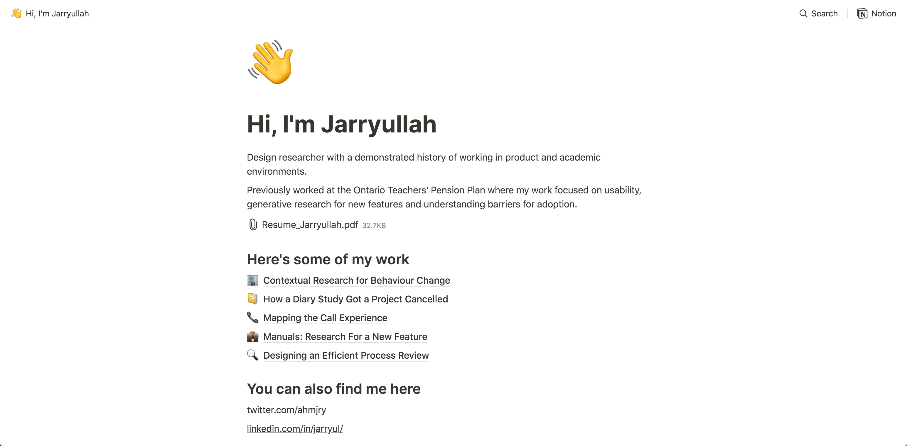
Your case studies should tell a coherent narrative about the type of position you want. If you are looking for a product design position, tailor the work you show toward that. It’s okay to cut out good case studies that don’t fit what you are looking for. As an example, it’d be better for someone looking for a product design position to have 3 product design case studies, and 1 in graphic design (4 total), than a candidate with 3 of each (6 total).
Case Study Content
After selecting the right case studies, it’s important to present them in the best way possible.
Guideline #8 – Process is important, but don’t forget about results
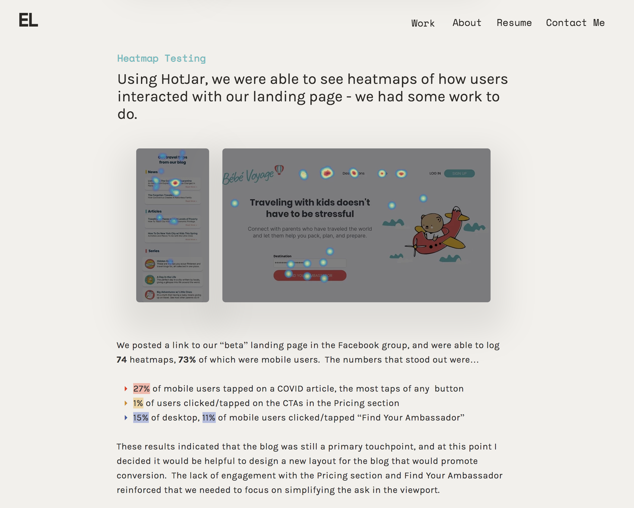
One of the most consistent issues I see with case studies is that the results or outcomes of the work are presented as an after thought, or not at all. I’ve been guilty of this too, because measuring the impact of our work isn’t always easy. However, the case studies that stand out most to me always try to emphasize the end results that were achieved.
Guideline #9 – Be careful with those personas!
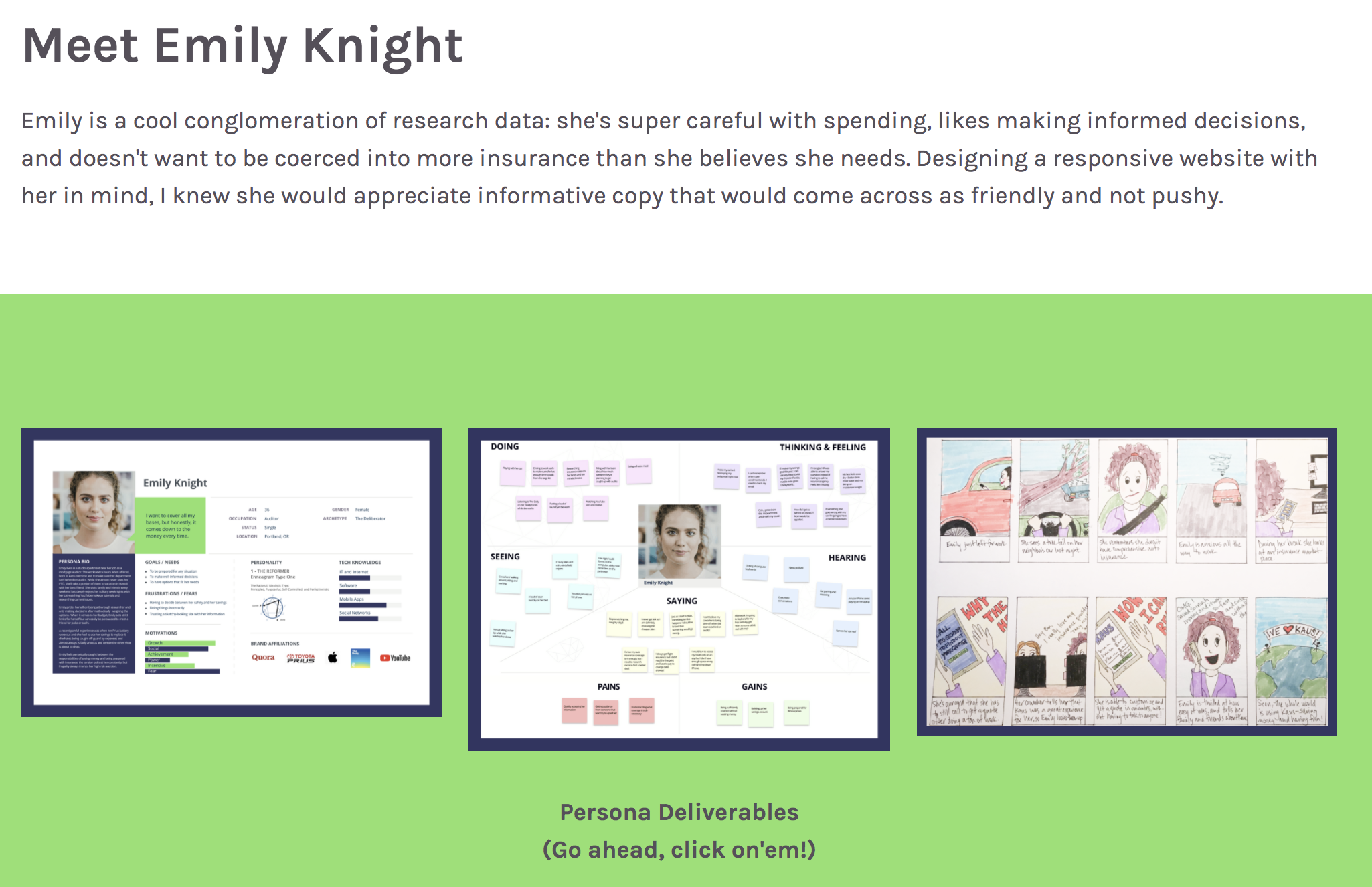
Personas, in general, are a great tool in the design process. However, if they aren’t based on enough research, I sometimes find they can reinforce our pre-existing biases about our users.
Where I’ve seen personas go wrong in a portfolio is when they perfectly reinforce the original challenge of the design. This makes everything feel a little too perfect for what is typically a process of discovery and iteration.
Guideline #10 - Embrace the messiness of the design process
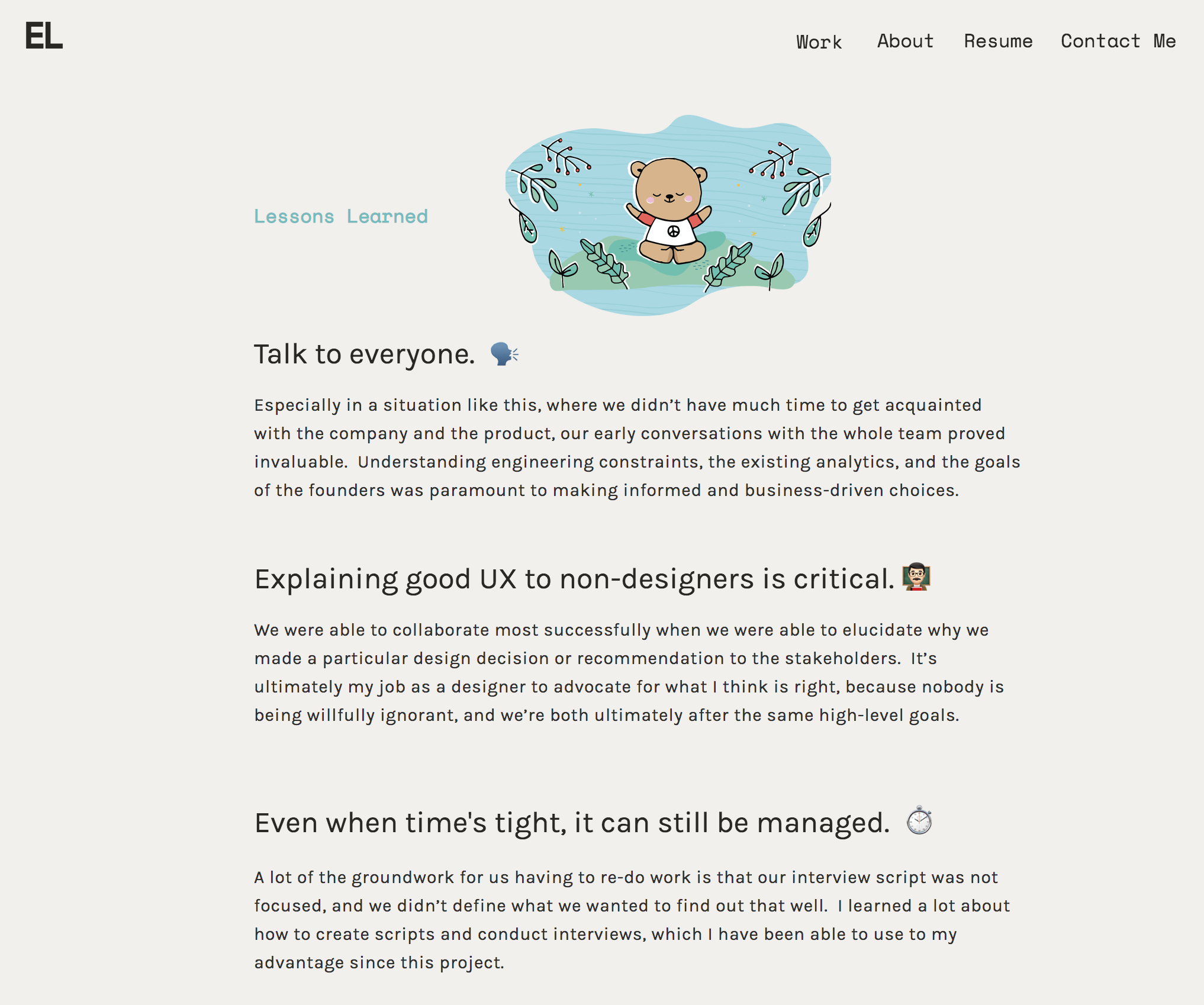
As you probably already know, the design process is never a clear path from point A to point B. Instead, it’s all about iterative learning, and getting your hands dirty. For some designers, I think there’s a temptation to hide or polish up this messiness when writing case studies.
This could be just me, but I love seeing the messiness of a real design process. Seeing that reflected in a case study shows maturity (you’re able to talk about what didn’t work as well), and gives me confidence in your ability to work through complex problems.
Guideline #11 - Include enough context about your work
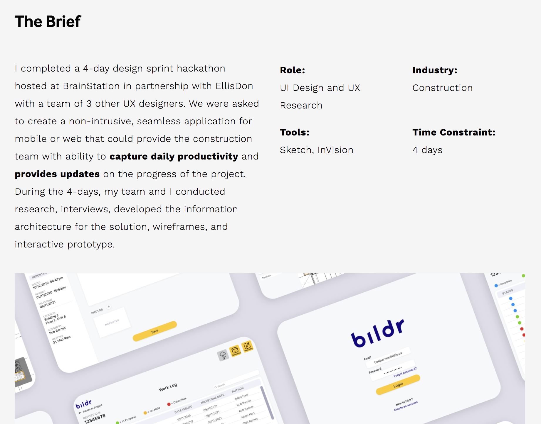
It’s easy when you are talking about your own work to assume too much, and not include enough context around the background of a case study. Without this context, for instance, it’s difficult to figure out if a project was done as part of a class, or for a real client. It might also make it harder to understand what your role was on the project.
Case study summaries are a great way to handle this, while also not drawing attention away from the main content.
Portfolio UIs
I’ll be the first to admit that I’m not the most talented visual designer, but I do think it’s worth touching on a portfolio’s user inferface for our last guideline.
Guideline #12 - UI trends are okay, but let your personality come through
The best portfolio designs that I see are able to leverage trends in UI design to look up to date, and modern. However, these portfolios do this in a way that’s still original, and not visually cliché.
That’s a tough balance to strike, but there are some things I feel like you should definately avoid:
- Stock Illustrations – If you have illustration skills, they are a great thing to include on your portfolio. If you don’t, you should avoid using stock ones like Undraw.
- Inaccessible color combinations – When working with color, make sure all your combinations of text colors and backgrounds are accessible, and pass WCAG color contrast checks.
- Branding Inconsistency – If you are creating a resume to go with your portfolio make sure the branding is consistent between the two.
Guidelines, not rules
Thank you for reading these, and I hope you found them helpful! Just remember they are meant to be guidelines, and not rules, and good luck with those portfolios!
